The interior stylist behind the big pastel trend on Instagram: How to decorate your holiday home with pastels
We've had a chat with interior stylist Sussie Frank about her work process behind decorating holiday homes, among other things, with lots of colours. Read on and learn how to select, combine, and work with colours in your decor, and how you can specifically create a mood board to work from when decorating your holiday home.
As co-owner of a paint company and a trendsetter in pastel colors in the summer house, it's no secret that Sussie Frank loves colors; working with them and combining them in harmonious and sometimes surprising ways. As a home stylist and creative consultant, she helps others decorate beautiful homes, and she puts love into the interior design of her own two summer houses, 'Det lille sorte' and 'Trækassen'.
In connection with Landfolk's podcast, Sommerhusliv, we had a chat with Sussie Frank about, among other things, her work process behind decorating with colors.

No posts on Landfolk.com are sponsored or otherwise supported by companies mentioned in interviews or other articles. Interviewees participate solely by virtue of their expert knowledge or experience.
Sussie Frank has a career in fashion behind her, but when the family bought a summer house in 2017, it became the starting point for her journey into working professionally with interior design.
»I've always had something to do with styling in one way or another, and I've now shifted that to the home side. My entry point was that we bought a summer house just under five years ago, which we renovated and thought should be allowed to be my little playroom. There I could try to develop a pastel story without any interference from others,« she explains.
The original pastel summer house
It became the beginning of one of the summer houses that in recent years has inspired many to renovate and decorate with pastel colors in their summer houses.
When I made it five years ago, there wasn't really anyone who had this pastel in a summer house. And it wasn't something you just did everywhere in your own home.
»I had a dream of being able to go all out with colors, flea market finds, mixing, and all that. So my husband, Rasmus, said, 'try to see if you can live out something with this, and it might change your direction'. And then I actually spent a year renovating it«.
»It was an estate, so we also had to clear out all the furniture and sort through it. Therefore, we could make it very personal by giving new life to the furniture that remained. And when I made it five years ago, there wasn't really anyone who had this pastel in a summer house, and it wasn't something you just did everywhere in your own home«.

Fun fact, when we started Landfolk, Det lille sorte was actually a really big source of inspiration for us. I hadn't seen it done before – it was a bit of a new take on what a summer house could look like. What made you think it should be a pastel universe and that it could fit into a summer house?
»It was because we lived in a newly built house. With stone floors and acoustic ceilings, you just don't paint all these pastels in. So I had a couple of individual surfaces I had painted at home, and I also had a lot of interior, but the summer house, it just had to be allowed to have its own life where I could go completely wild with colors and have this playground«.
I didn't have to ask anyone, I didn't have to be like 'oh, are you traveling? Then I'll just paint this blue wall before you come home'.
»And then there still had to be a good balance, so it wasn't confusing to look at, but still cozy to enter. It had to be a sanctuary that could also be rented out, where you could relax and just be. And then it was just incredibly fun to be allowed to. I didn't have to ask anyone, I didn't have to be like 'oh, are you traveling? Then I'll just paint this blue wall before you come home'«.

Was there anything in Det lille sorte summer house where you made a choice and thought, uh, it's a bit exciting how this will turn out, or did you feel confident all the way?
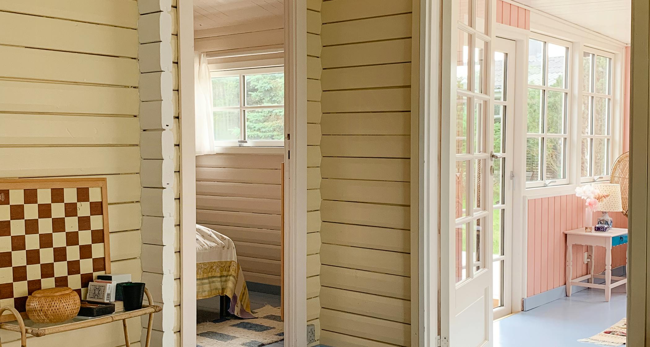
»I felt completely confident all the way, because I had chosen three colors that were meant to complement each other throughout the entire interior. It's important not to just slap on colors. There needs to be a calmness to it. So the only thing where I thought it might be a bit exciting to see if it works was the floor. I painted it blue like the sea, sky-like, because it had to have a good vibe in relation to it being a summer house«.
»And if you paint blue floors all over along with colored walls, and the interior is also colorful, then it might be a bit too intense. But since I chose other things that provided a bit more calm, it wasn't so intense. So it worked out super well«.
»And the eye reaches far. So you stand in a room and look forward, and then you see a new floor, new wall color, new interior color, then it becomes really restless for the eye. So choosing one large and strong surface, such as the floor, that has one color, provides uniformity and synergy through the rooms. And then the wall colors and interior shouldn't be completely off either«.
»But you have to remember that interior, textiles, and all that also come in. Suddenly it can become very cluttered. So it's about finding three-four base colors, which you say, that's what we're going big on. And then it gets new life with all the things you also put in. So there shouldn't be too many colors«.
I am very structured in my head and also like it to be visual. Then you have something visual to go by and you can quickly eliminate some bad purchases in advance.
The process behind decorating with colors
Although there shouldn't be so many colors that it becomes cluttered and restless, there's plenty of room for playing with colors at Sussie Frank's – as long as there's thought behind it, and the combination of colors, textiles, and personality works.
»Colors are what define a room in some way. It can feel warm if you enter a sand-colored room rather than a room with just white walls. If you then put in some travel souvenirs or a flea market find or something else that means something to you, then you have a story«.

And with colors in particular, it yields good results to work in an organized manner, she explains – for example, by starting with a well-thought-out premise. Here are her best tips on how to do it:
1. Create a mood board you can use as a starting point
When she decorates, Sussie Frank usually uses a specific approach and a few rules of thumb to ensure that, despite a lot of play with colors, she ends up with a nice and cohesive result. One of them is that she starts by creating a mood board with a color palette of the basic and accent colors she wants to use as a starting point.
“I love mood boards. I am very structured in my head and I also like it to be visual. Then you have something visual to go by and you can quickly eliminate some bad purchases in advance, so you don't make wrong purchases or choose the wrong colors. When I decorate for myself, for example in Det lille sorte, I have a good bulletin board with thumbtacks where I hang things up. It can be a piece of textile or sofa material and the wall color I have chosen. Then I slowly build up from there with what makes sense. Then it's about looking at what's finest up there – is it the pink one, or what is it?”
Once the base is laid and the starting point is there, the fun visits to flea markets and second-hand shops begin. And this is where I find the small quirks that need to match the rest.
It can be analog or digital, but it provides a good starting point and is a good rule of thumb, she says.
“You can also easily do it via Pinterest or other digital programs, but with my own decor, I like to make it a bit tactile too. I'm a bit of a nerd, so I think it's cozy.”
So when you have a physical mood board, do you take a picture of it to have it with you if you're going out to look for something new?
“No, I don't really. Once the base is placed on my mood board, I have it in my head. It's a good starting point, but I can also find something new along the way, so I change it. But the mood board is a good rule of thumb. It's the starting point, the kick-off, and then it goes from there. Once the base is laid and the starting point is there, the fun visits to flea markets and second-hand shops begin. And this is where I find the small quirks that need to match the rest.”


2. Select base and accent colors
Sussie Frank advises starting by selecting a base of three to four colors in the same shades* that fill the large surfaces in the summer house. Then you can choose up to five or ten ‘accent colors’ that complement the base colors well.
“It provides a great transition from room to room, but it also creates a synergy all the way through in some way. And then it's easier to add paintings or textiles in the form of pillows or rugs that have these bold colors or white-gray colors.”
Other shades and contrasting colors can then come in the form of accent colors:
“It can be a painting, it can be the sofa getting a different color, or a staircase or a kitchen, for example.”

Accent colors can also be a green book spine or a red wire basket in the kitchen, she explains; a tiny element that acts as a pop of color in the rest of the rooms. Above, for example, she has used details in chrome and brass as a form of accent colors against the large wooden surfaces in the summer house Trækassen. Because when you play with colors, according to Sussie Frank, it shouldn't be too stringent:
“It can quickly become too impersonal and too organized if, for example, it's very pink all the way through, so there should be something that stands out. The fact that there's a bit of personality in these small accent colors. As long as the base is corrected to three to four colors that fill the large surfaces, you can play with colors on the rest.”
It can be a painting or the sofa getting a different color, or a staircase or a kitchen, for example. But the wall color itself, that needs to have the base.
“Sometimes it can also be dominant to have a poster or some art, where there can often be a lot of colors. But that you have taken as a starting point that if there is a lot of green in a picture or painting, then maybe it's that green you bring down to a large surface. Maybe a green floor or something. Then it again gives peace to the eye that the picture hangs well with the rest.”
3. Let the shades complement each other
If you're not a color expert, how do you choose the three to four base colors so they go well together?
“A good starting point is to have some color samples and place three to four colors next to each other to see if they are in the same tone. But for me, it's always like this: if we say nude pink, and a blue and maybe a yellow, then it should preferably be in the light tone palette, i.e., the pastel palette. And then it might be that there's an outlier with a red or a green or a slightly vibrant color.”
Shade: colors that have the same amount of blackness and color intensity, but where one, for example, is beige and the other is green, like the colors below
The important thing is that the base colors complement each other and do not have too much contrast with each other. The base could also be cream, off-white, sand-colored, and gray – all sandy tones in the same shade – whereas orange, green, red, and blue, for example, would be too harsh combined as base colors, she explains. After that, you can choose accent colors that have some contrast – black, dark gray, or dark blue for the sandy colors, for example.
“It can be a painting or the sofa getting a different color, or a staircase or a kitchen, for example. But the wall color itself, that needs to have the base.”
It is also a way of thinking about colors in interior design that can easily be made flexible and economical if you choose calmer base colors for the fixed elements in the summer house:
If you have a dark blue pillow, you can more easily change pillowcases both cheaply and easily. So keep the base calm, and then go wild with the rest.

Written by Nina Lykke
March 2023
